
Comparative Insights Dashboard
Stimuli from different campaigns can be compared side by side to identify the best performing Stimulus.
The Comparative Insights dashboard allows users to compare the performance of up to three stimuli including stimuli from different campaigns.
Stimuli comparison is applicable only for Media and Shopper Insights. UX Insights cannot be compared as User Journey in any UX study is unique.
Stimuli can be compared side by side along with their respective charts that provide insights on,
Affect Lab, attention, and engagement scores Emotional spread and percentage distribution Heatmap, transparency map, gaze plots and Participants' demographic insights
How to add Stimuli for Comparison
Follow the below steps to add stimuli in the Comparative Insights Dashboard. The Comparative Insights Dashboard appears as shown below,
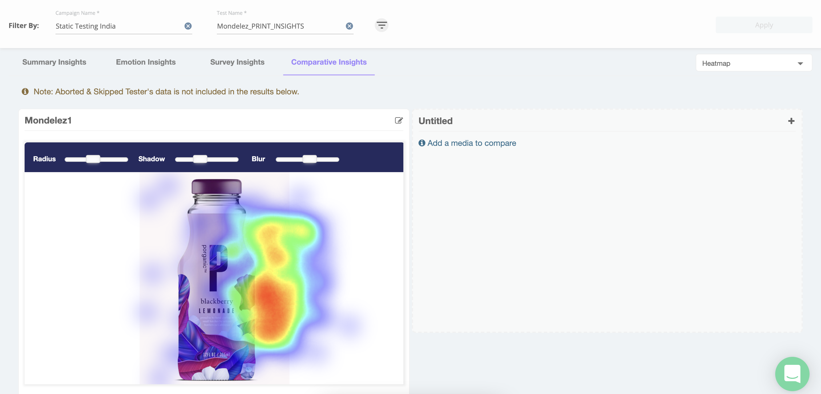
Up to three stimuli can be compared side by side and the first stimulus gets pre-populated from the current campaign.
To add new Stimuli,
Step 1: Click on the Plus (+) sign available in the Untitled section. Add Media window appears as shown below,
The pre-populated stimuli can be seen in the Column distribution section. Users can remove the stimuli to add a different stimulus or proceed to add additional stimuli.
Step 2: Select Campaign, Step 3: Select Test,
Step 4: Select Media,
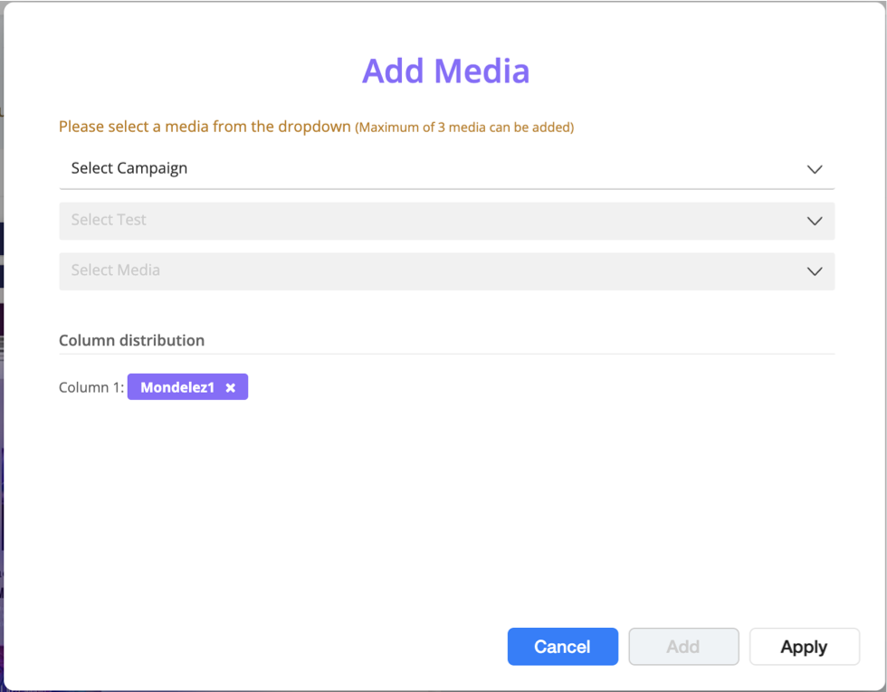
The above three fields are drop-down lists that show values from the available campaigns, tests, and media respectively.
Once the desired Stimuli are selected,
Step 5: Click on Add,
Follow the above steps to add the required stimuli and
Step 6: Select Apply.
The Comparative Insights Dashboard gets populated with the selected Stimuli and their other charts below the Stimuli.
Stimuli comparison is possible among similar stimuli types only. i.e. Stimulus from one Media Research campaign can be compared with Stimuli from other Media Insights campaigns, where the test type also is the same (FC, ET, or FC&ET).
Similarly, for Shopper Research campaigns, Virtual and Interactive shelves can only be compared against other Virtual/Interactive shelves.
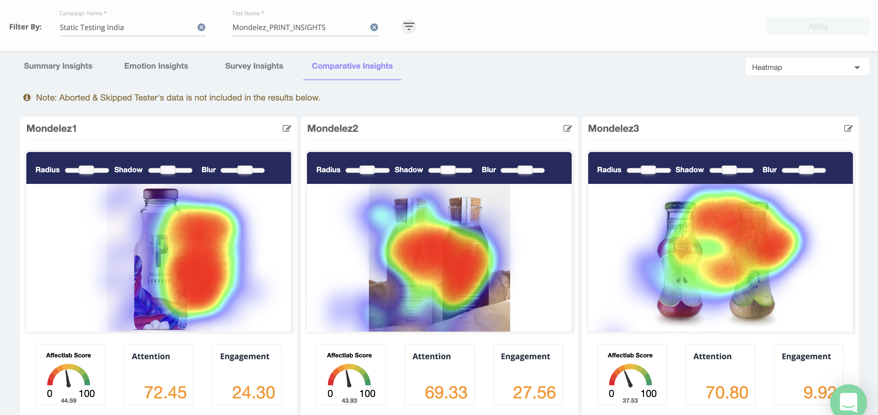
Below is a snapshot of the Comparative Insights Dashboard from an illustrative campaign. The stimuli are arranged side by side along with other insights.
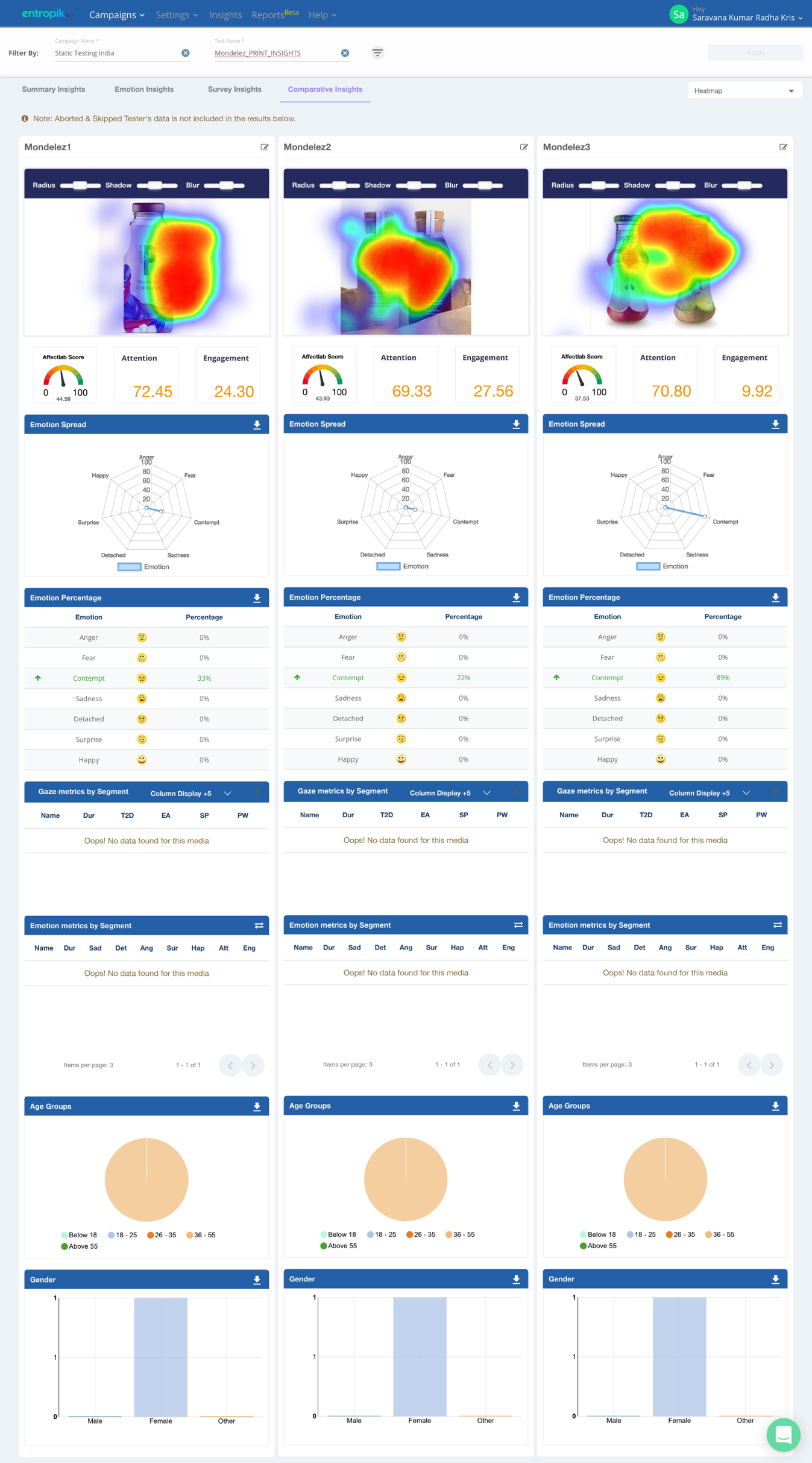
Chart and Insights available in the Comparative Insights Dashboard
The first section shows the three selected stimuli. For Eye Tracking tests users can choose between the Heat map, Transparency map, and the Gaze Plot. Below the stimulus, the key emotional metrics (Affect Lab, Attention, and Engagement score) from Facial Coding tests are populated.
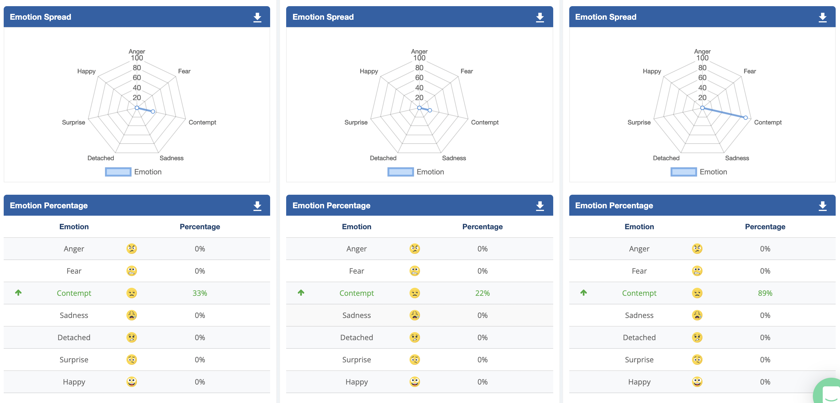
Emotion Spread and Emotion Percentage (Facial Coding) - Respective Emotion spread and Emotion percentage of emotions such as Happy, Anger, Fear, Contempt, Sadness, Detached and Surprise can be found below the stimulus.
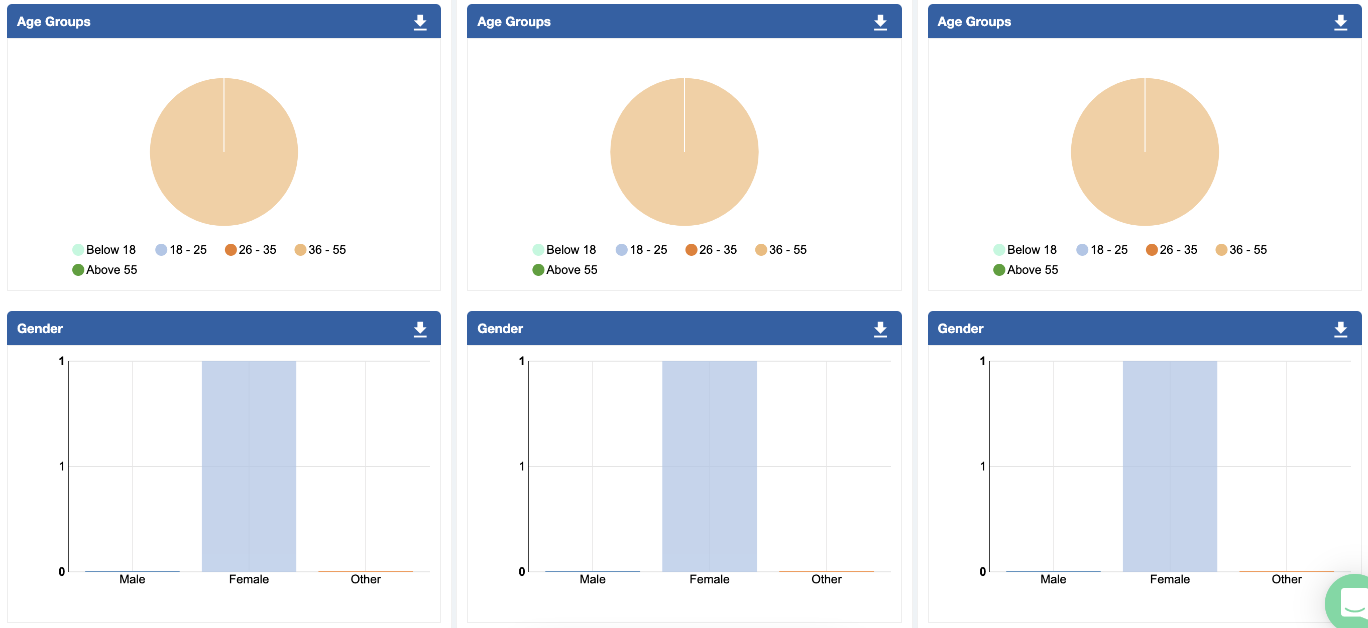
Participant's Demographic Insights - Charts on participants Age Groups and Gender provides demographic insights.
The comparative insights dashboard provides a comprehensive view of the various insights and acts as a one-stop solution for comparison requirements.