Media Dashboard in Insights Beta
The Media Dashboard in Insights Beta provides detailed charts for all the media-related information captured in the platform using technology like facial coding and eye tracking.
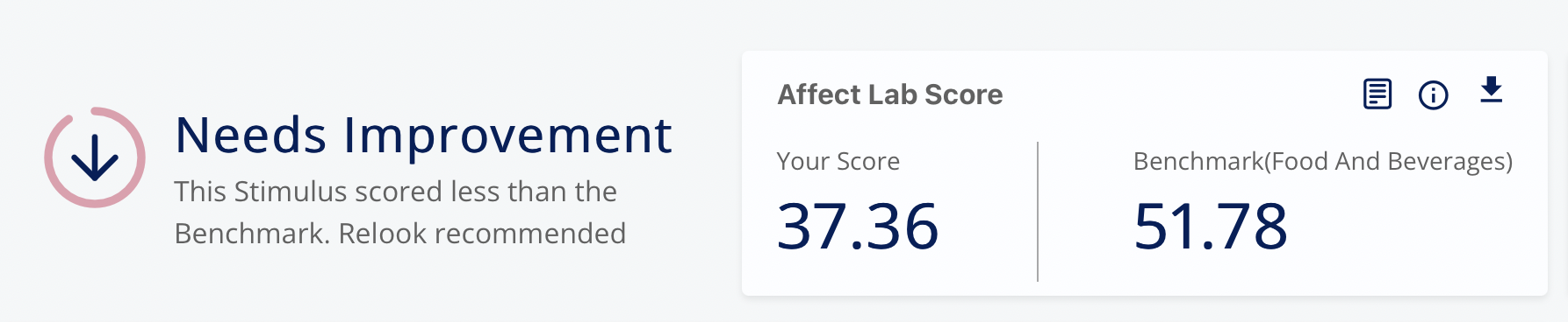
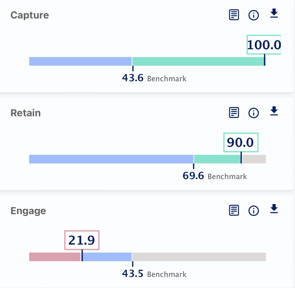
The first thing available in the dashboard is the overall performance of the media compared to the other media of the same category. The overall score of your media is compared with the category-wise benchmark scores available on our platform. It further tells you if your media needs improvement or if it performed well against the available other media in the same category.
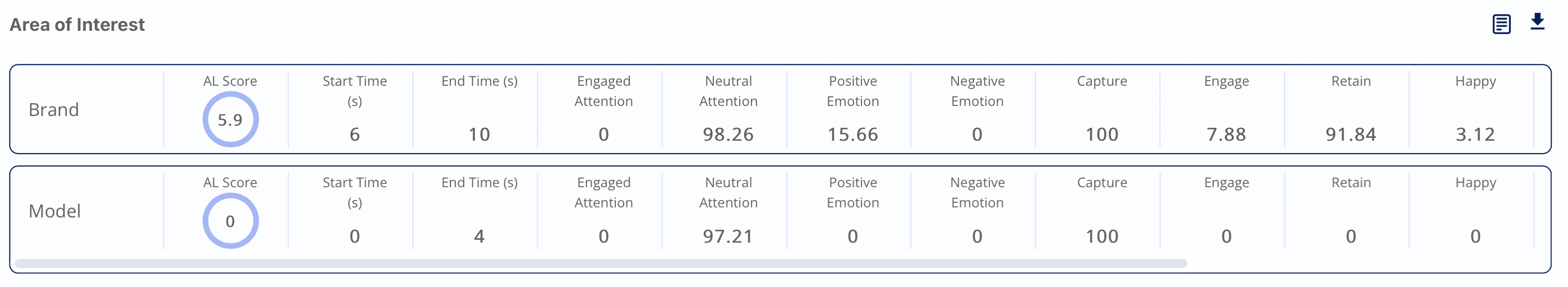
Capture: It is calculated as the average first distraction of the user. It shows how efficient your media was in capturing the viewers' attention. The higher the score higher would be media attention-grabbing.
Retain: It is the measure of user attention after 5 seconds of viewing the media.
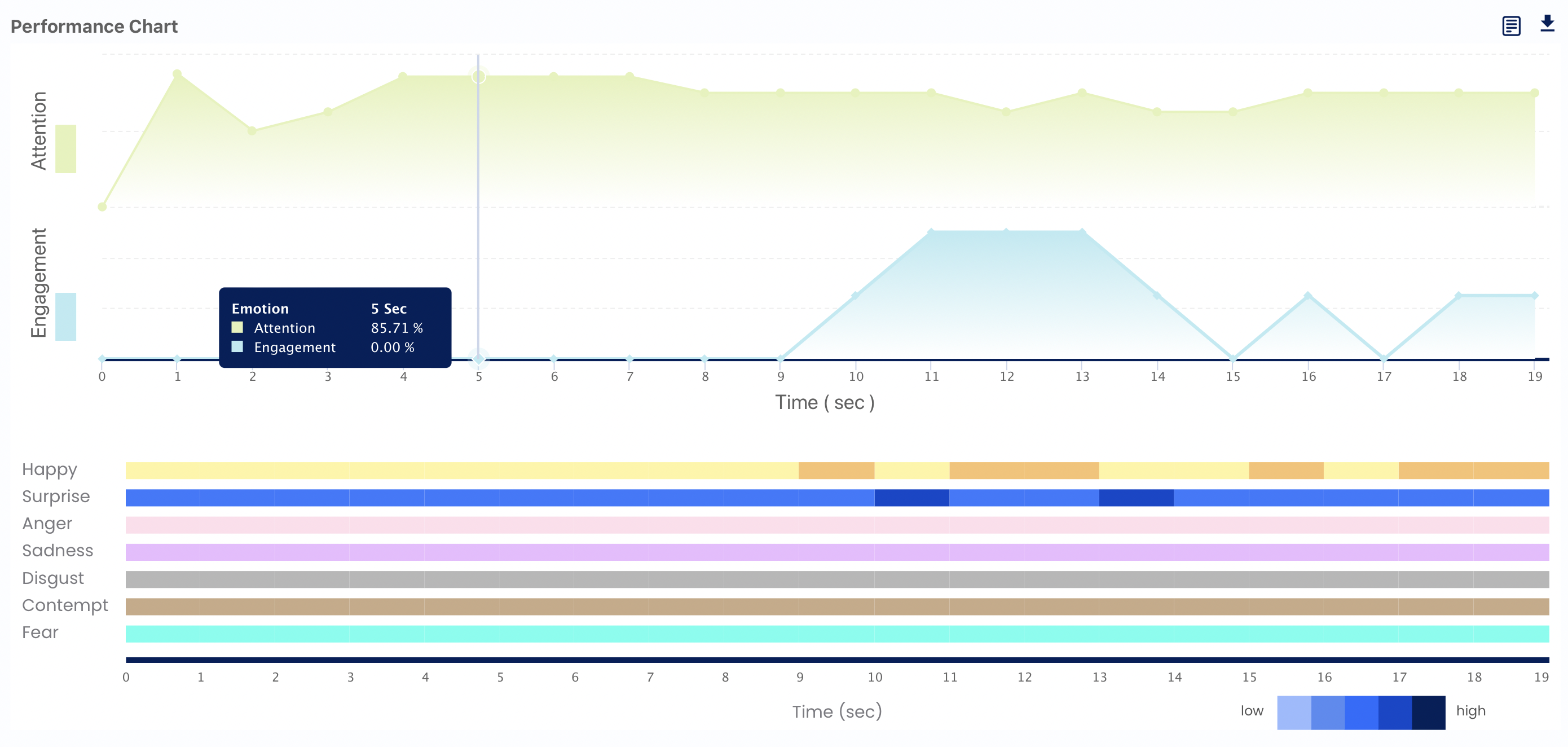
Engage: This chart shows the engagement of the viewers with the media and is calculated as the sum of the overall emotional reaction evoked by the viewer at a particular second.
Area of Interest: the users can select a particular time duration from the media called "SOI" and test how their media performed in the selected time duration, all the scores captured during that time will be available in these charts.
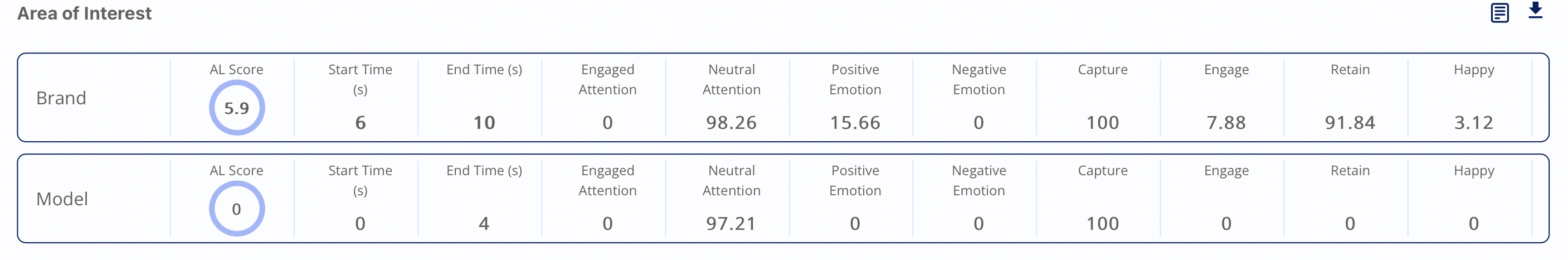
To understand how to create SOI, click here.
Attention distribution: For every media, attention is categorized into three parts, which are as follows:
- Engaged Attention: when the viewer is actively watching the media.
- Neutral Attention: when the user is passively viewing the media.
- Attention: overall attention of the viewer.
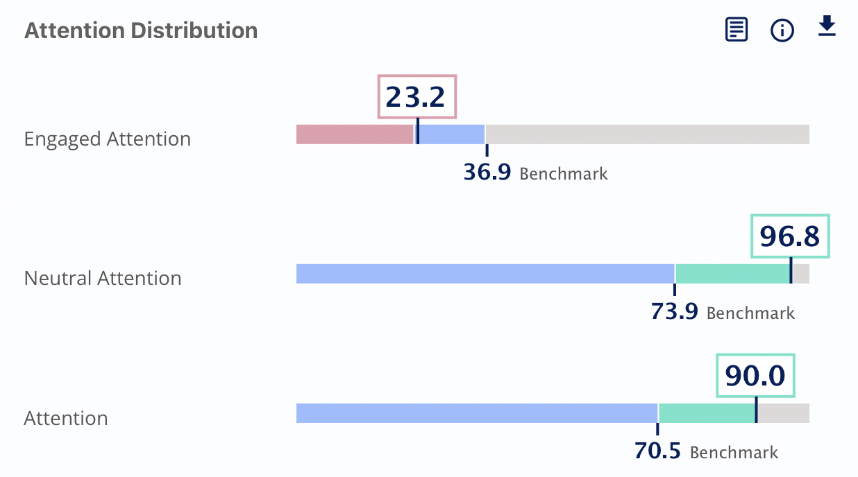
The scores for these three categories are available in the attention distribution graph with the benchmark scores for comparison.
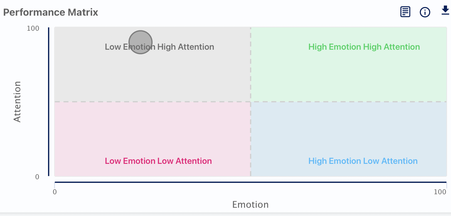
Performance matrix: This chart shows the performance of your media based on the mentioned scores and attention of the viewers and tells which quadrant the media will fall; the media with high emotion and high attention are supposed to meet all expectations.
Performance Chart: It provides the second-by-second attention, engagement and emotion scores of the viewer. The chart is present in the form of a line graph to see the scores hover over the timelines; a small information box will appear with the actual scores for that second.
For the emotion graph, the brighter colour represents the higher scores.
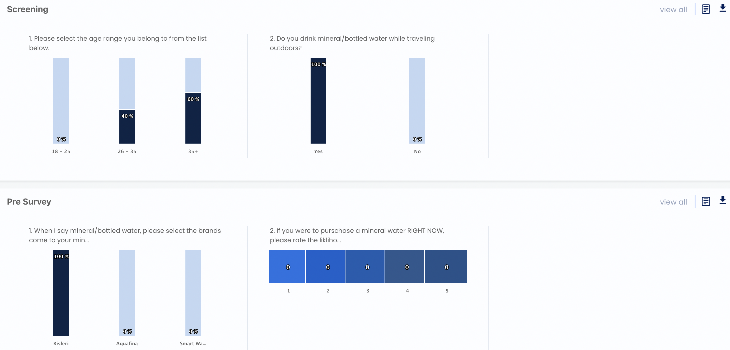
Screening, pre-survey and post-survey Responses: These charts show the responses of the users to the questions added n the screening, pre-survey and post-survey stages.